Coordinate Patterns Perfectly with these 5 Tips
If it wasn’t obvious by now, I’m a pattern lover! I love designing patterns and surrounding myself with them in my home. (Not to mention wearing them!) As a result, I often get questions from friends and clients about how best to coordinate patterns in a room or project. I’m not an interior designer, however, during my career as a textile designer, I put many collections of fabrics together for presentations. This was usually the final step of the design process. After that, these collections were used in sales presentations to customers and clients. Putting collections together always took the fabrics to a different level. In other words, it made it easier for buyers to visualize them together in their final product.
Putting multiple patterns together can be a bit daunting, but I have a few favorite strategies I used over the years (cough: decades) to create beautiful collections of patterns that work well together.
Here are 5 of my proven tips on how to coordinate patterns.
Choose one feature pattern.
Every collection needs one pattern to anchor it. Choose one pattern to make the biggest statement and let that be the feature pattern that you use as your guide in putting the rest of the collection together.
Choose coordinates of different scales.
With your feature pattern as your guide, choose additional patterns of varying scale and style to coordinate with that feature. For example, if you have a large floral as your feature, think about choosing a smaller nonfloral pattern and something more structured like a chevron or a stripe.
Coordinate the different patterns with color.
Tie all the different patterns together with a common color. Again, let your feature pattern lead the way. Look at what colors are in that patterns and choose colors from your feature. They don’t have have to be exactly the same, but if they are all in your feature pattern, then you know they already go together well.
Mix in solids.
Don’t forget about those solids. Your eye needs a place to rest every once in a while and solids serve that purpose well. Ground your collection of different patterns by using solid colors or subtle textures.
Put distance between patterns.
Once you have your collection ready to go, add some space between them if they seem to be creating tension. This is where those solids come in handy. Rather than putting your feature pattern right next to or on top of one of those coordinates such as a polka dot or a stripe, use a solid to add a bit of distance between the patterns.
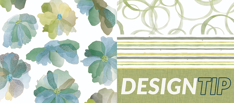
The patterns we used in our example were our Watercolor Floral (P639), Watercolor Rings (P812), Painted Stripe (P570), and Linen Texture (P784).
How do you like to mix up patterns in your projects? What tips and tricks do you use to help them work together? I’d love to hear what works for you in the comments or share your photos with us on Instagram.
Share this post
Author
DESIGN/COLOR TRENDS AND AWESOME INFORMATION IN YOUR INBOX
Sign up for our monthly trend letter

